X-Rite’s Color measurement for dye houses improves color quality on a variety of textile materials and helps reduce impact to the global environment.
SETTING UP A SUCCESSFUL VISUAL COLOR EVALUATION PROGRAM
Introduction
The world of design and manufacturing heavily relies on achieving the desired color in materials. Color plays a critical role in product aesthetics and customer satisfaction. Brands are increasingly using color and appearance to differentiate their products, and speed is everything.
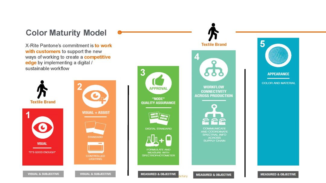
The journey from concept to production involves several color critical stages—design, prototyping, specification, formulation, production, quality control, and final product approval with brand owners. Each stage can introduce challenges related to color accuracy, consistency, and efficiency.
Challenges in Traditional Color Design
in a traditional color design workflow, there are many opportunities where color can go wrong.
IMPROVING COLOR THROUGH VISUAL ASSESSMENT
There are three key factors that must align for color to be perceived:
- Light: Light contains all colors, but it doesn’t have color itself until it interacts with an object.
- Object: The object acts as a filter, reflecting or emitting the color we see.
- Observer: The final element is the observer, who perceives the color.
All three factors together create color. Any variation in one of these factors can change the perceived color.
Visual Assessment Requirements:
Specified Light Source – calibrated and certified annually
Standardized Procedure – documented in an SOP (Standard Operating Procedure).
Known Evaluator Color Discrimination – tested & certified yearly
Properly Maintained Color Standards – documented & controlled
Why Standardized Lighting is Critical for Visual Color Evaluation
Light is essential in visual color evaluation, but not all light is the same. White light is made up of all colors in the visible spectrum. When the light source changes, the appearance of color can also change. Different light sources emit varying amounts of spectrum colors, which impacts how we perceive the color of an illuminated object. The lower the color temperature of the light source, the warmer or redder the source will be. Inversely, the higher the color temperature of the source, the cooler or bluer it will be.

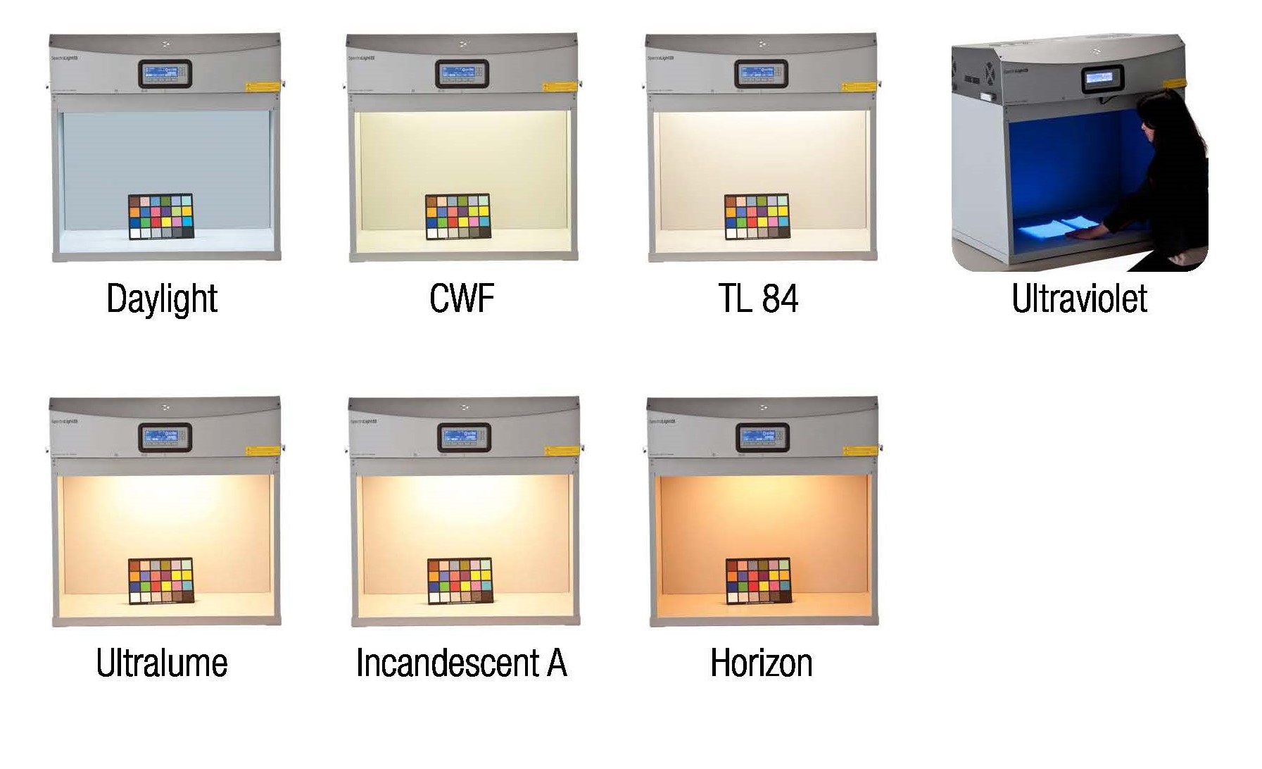
So what is the best light for color evaluation?
Color evaluation should be performed under all light sources where the final product will be seen. Light booth allow us to simulate different lighting conditions by controlling the amount of spectral energy emitted.
Most industries today have standardized on one or more viewing conditions that best reflect where and how their products will be viewed.
Simulated illuminant D65 is commonly used to represent the color of daylight close to noontime, while F11 represents typical lighting in stores and offices.
Have you ever noticed two samples look identical under one light but different under another? This is known as metamerism, which occurs when colorants or pigments have varying spectral properties. Metamerism is a significant challenge for both designers and suppliers, making it hard to achieve consistent color accuracy across different lighting environments.
If your product contains optical brightening agents (OBAs), you’ll need a UV light source to assess their impact accurately. Products with more OBAs will appear lighter under UV light.
Visual evaluation is one of those tasks that seems simple but in reality is quite scientific and complex.
If you want to produce and ship products that will please your customers, you need to have a solid visual evaluation process in place, and it must involve a light booth.
Standardized Procedure – documented SOP
Present the Sample and Reference for Visual Evaluation
Visual evaluation is subject to human error. Follow these guidelines to eliminate the main sources of visual evaluation error.
- Position samples to ensure they are viewed at the correct and consistent angle.
- Avoid wearing bright-colored clothing or having objects in the light booth, as they can affect color perception.
- Keep the light booth in a dark room without other light sources.
- Do not wear tinted contacts or eye glass lenses, as even a slight tint can affect your color perception.
- Place the sample and reference side by side with no gap in between, allowing for accurate comparison.
- Evaluate the samples within a few seconds to prevent eye fatigue, which can distort color perception.
Properly Storing Physical References
Physical color standards can accumulate dirt, smudges, or fade over time, which can alter their accuracy. Here are some tips to extend their lifespan:
- Create identical duplicates when producing the original standard. Archive one carefully as the “master” standard and use the others as working standards.
- Store and use the working standards one at a time, replacing them when they fade or become damaged.
- Ensure the standards are securely controlled and only accessed by authorized personnel.
- Regularly audit the working standards by measuring and comparing them to the master standard. Replace them when deviations exceed the acceptable tolerance (e.g., more than 5%).
Color Vision Acuity
Many people don’t even know they have some type of color deficiency, but it is incredibly common. In fact, approximately one in every 12 men and one in every 200 women worldwide have some form of color vision deficiency. Anyone responsible for making color decisions should take a color vision acuity test, such as the Farnsworth-Munsell 100 Hue Test, at least annually under controlled lighting conditions.
The Farnsworth-Munsell 100 Hue Test consists of four trays containing a total of 85 removable color reference caps that span the visible spectrum. To determine color vision aptitude, the test subject must sort the color caps in incremental order of hue variation under standardized daylight conditions
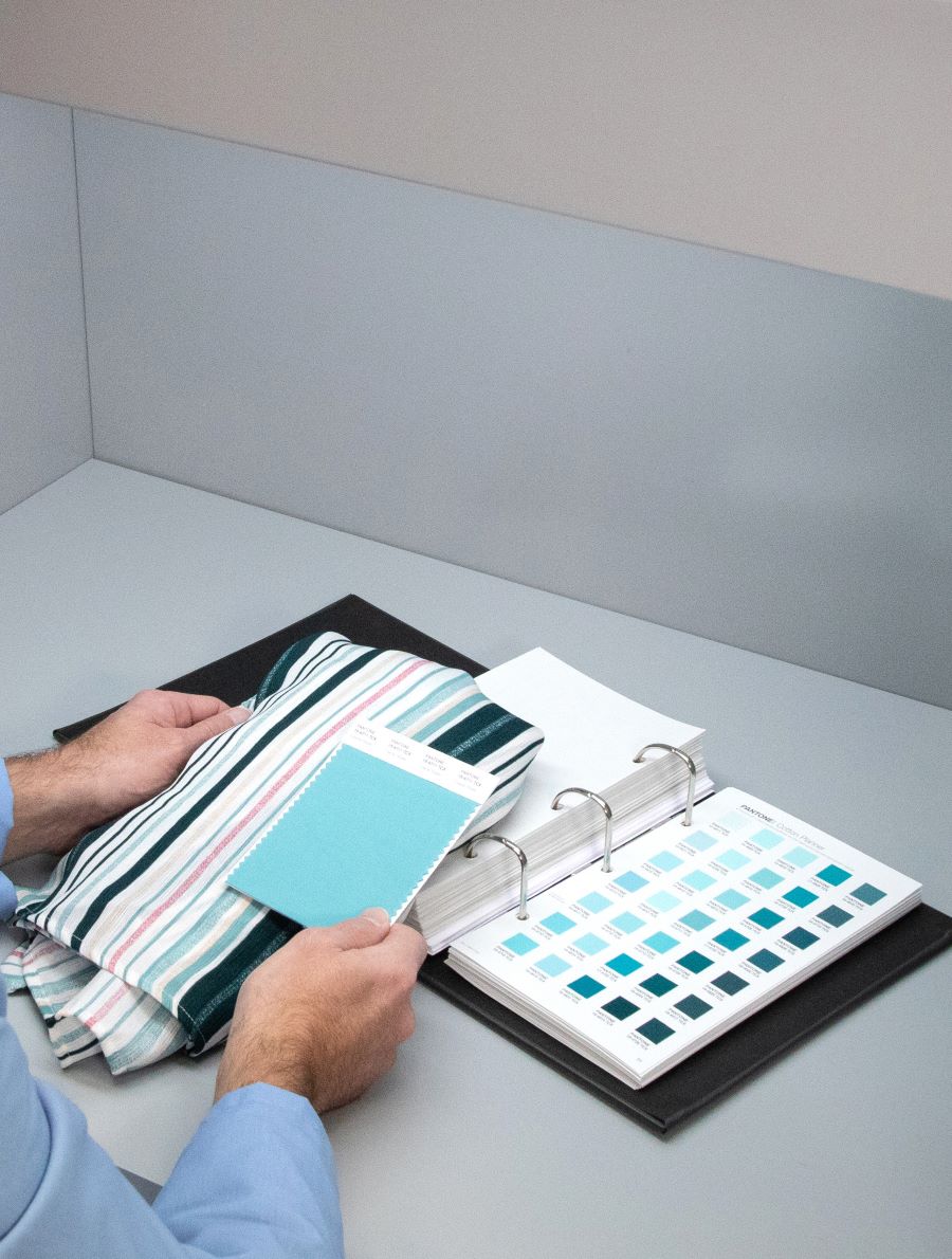

Follow the Standards for Your Industry and Customers
In addition to standard viewing conditions, the International Standards Organization (ISO) has developed specific standards for visual color evaluation, including ISO 23603 for manufacturers. ISO standards provide a solid foundation for a visual color evaluation program, but always check with your customer to ensure you are following the correct standards for your industry.
Many companies recognize the importance of color measurement but overlook the need for proper visual assessment.
Visual evaluation is a crucial step in every color control process
A failproof visual evaluation program requires standardized lighting, a physical color reference, and color vision acuity to predict how color will look under multiple light sources to avoid color surprises when the light changes.


